Introduction
Helping users build their mattress and compare features through a new PDP buy box structure
Overview
In my role at Tempur, I lead annual UX benchmarking and user research initiatives across all core pages for TEMPUR International. I focused on collecting qualitative insights through Hotjar and Google Analytics, A/B testing to evaluate site usability and navigation. This research uncovered key themes and usability challenges that shaped the direction of our next-phase design work.
In close collaboration with our development team, we created new Product Detail Page (PDP) concepts aimed at solving user pain points through two distinct UX approaches. By testing these concepts side by side, we’re able to validate our hypotheses and better understand which experiences most effectively engage and convert our customers.
Overview
Lead UX UI, Backend & Frontend Developers
Tools
Figma, Hotjar, Google Analytics, A/B Testing Salesforce
Design Solutions
Visuals, content, hierarchy –
2 unique concepts A/B tested
Usability Testing the old
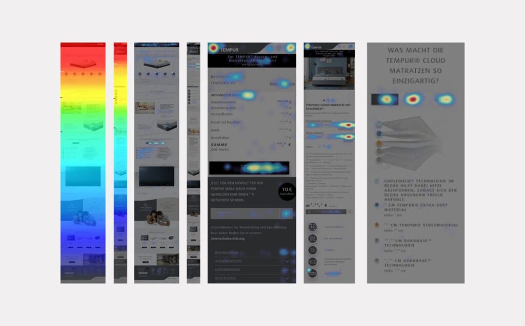
User Research
Uncovering user pain points in the old mattress product page template
Methodology
Using Hotjar and Google Analytics, I conducted a mixed-methods usability analysis focused on the mattress PDP. Heatmaps and session recordings from Hotjar provided qualitative insights into user behavior—such as scroll depth, click patterns, and hesitation points—across both desktop and mobile sessions. In parallel, Google Analytics helped identify high-exit points, bounce rates, and user flow drop-offs. Together, these tools revealed key friction areas in the user journey, which directly informed priorities for the PDP redesign.
User Qualifications
Ages 26–65
Household income of $40k–$150k
Must purchase products online at least every day, week or month
Have purchased from a select list of major brands including TEMPUR, Dreams, John Lewis, Amazon
Identified improvement areas
After watching user recordings, I identified key themes that would drive the redesign of the page to have a more intuitive experience and address pain points.
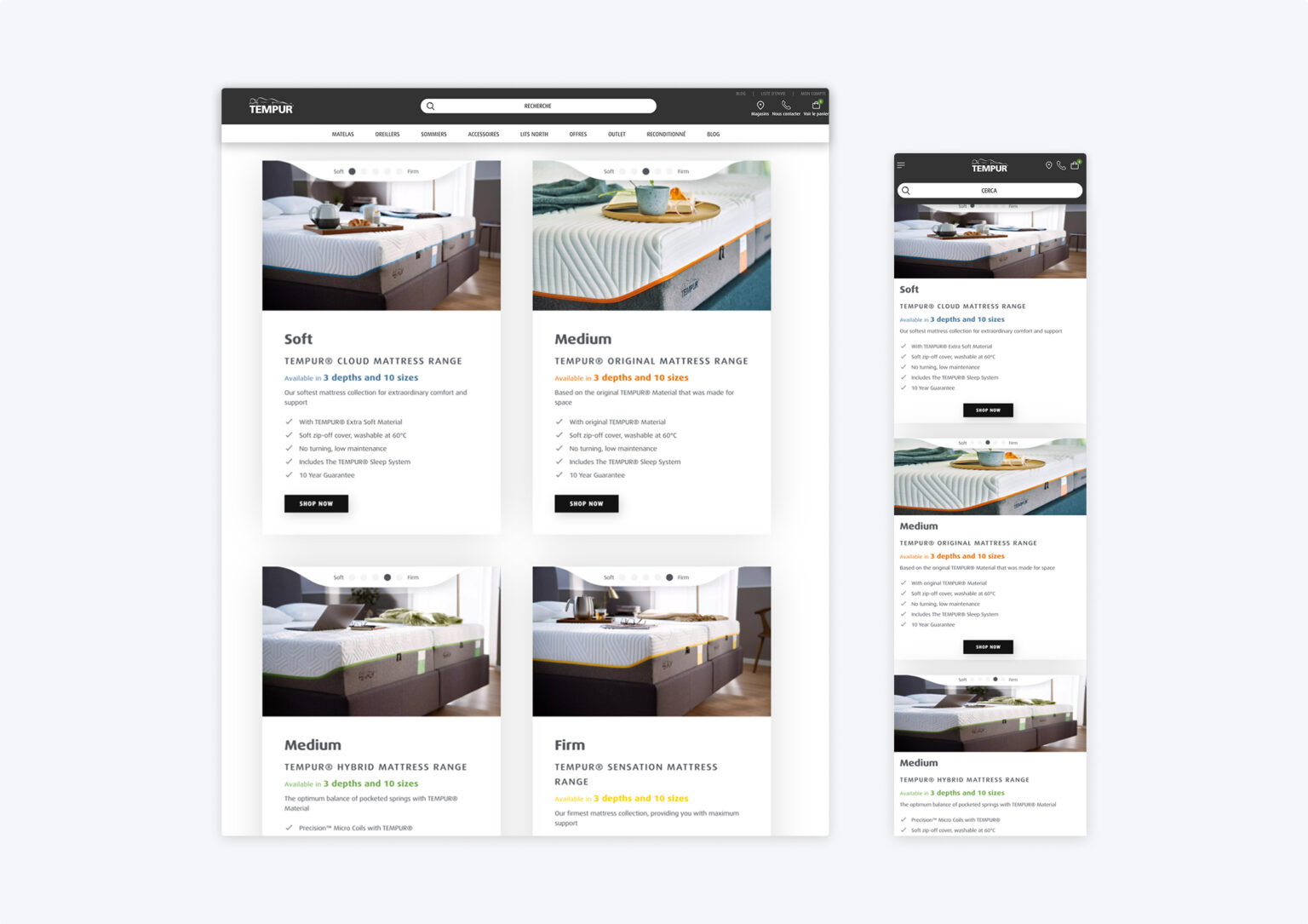
IMPROVE MATTRESS CONFIGURATION STEPS
TAILOR CONTENT/HIERARCHY TO USER PREFERENCES
REDESIGN BUY BOX ORDER SUMMARY SECTION
REDUCE VOLUME OF UPSELL MODULES
Interested in viewing the full research findings deck?
Interact with this live PDF!
After collecting all user sessions, I created a deck that highlights user feedback and recommendations for a new PDP structure. **This deck provide a full site audit Home, Menu, Mobile, PLP, PDP, CLP, copy assets and SEO.
Exploring Solutions
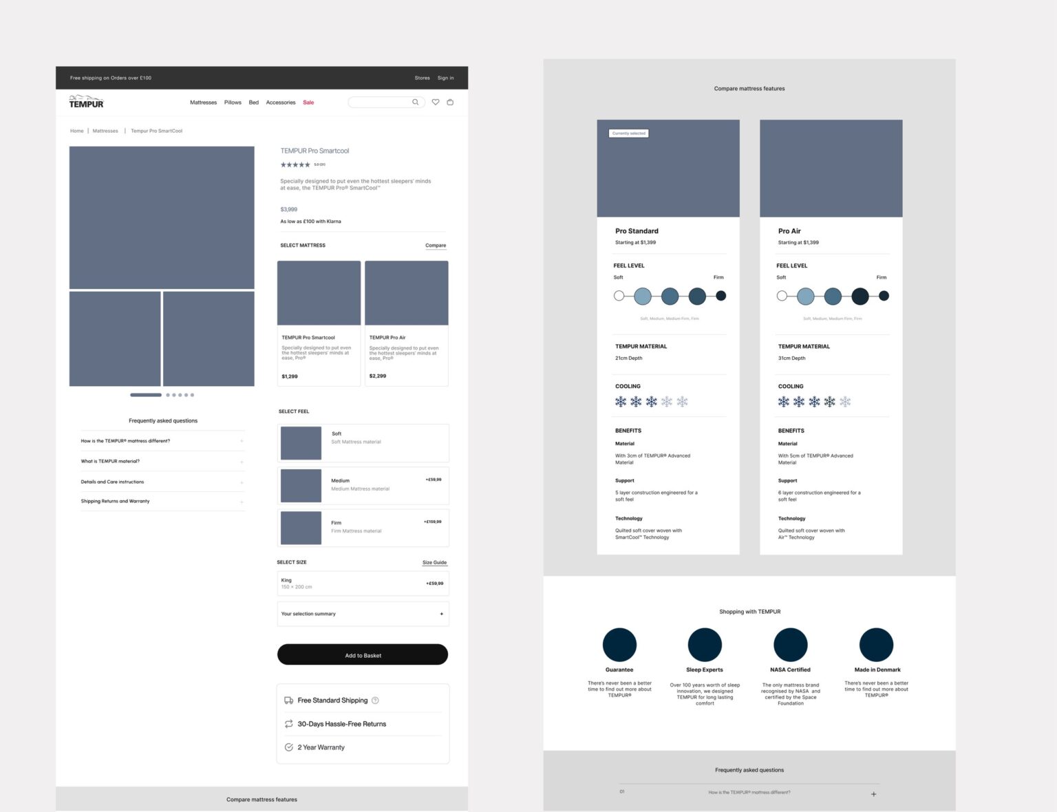
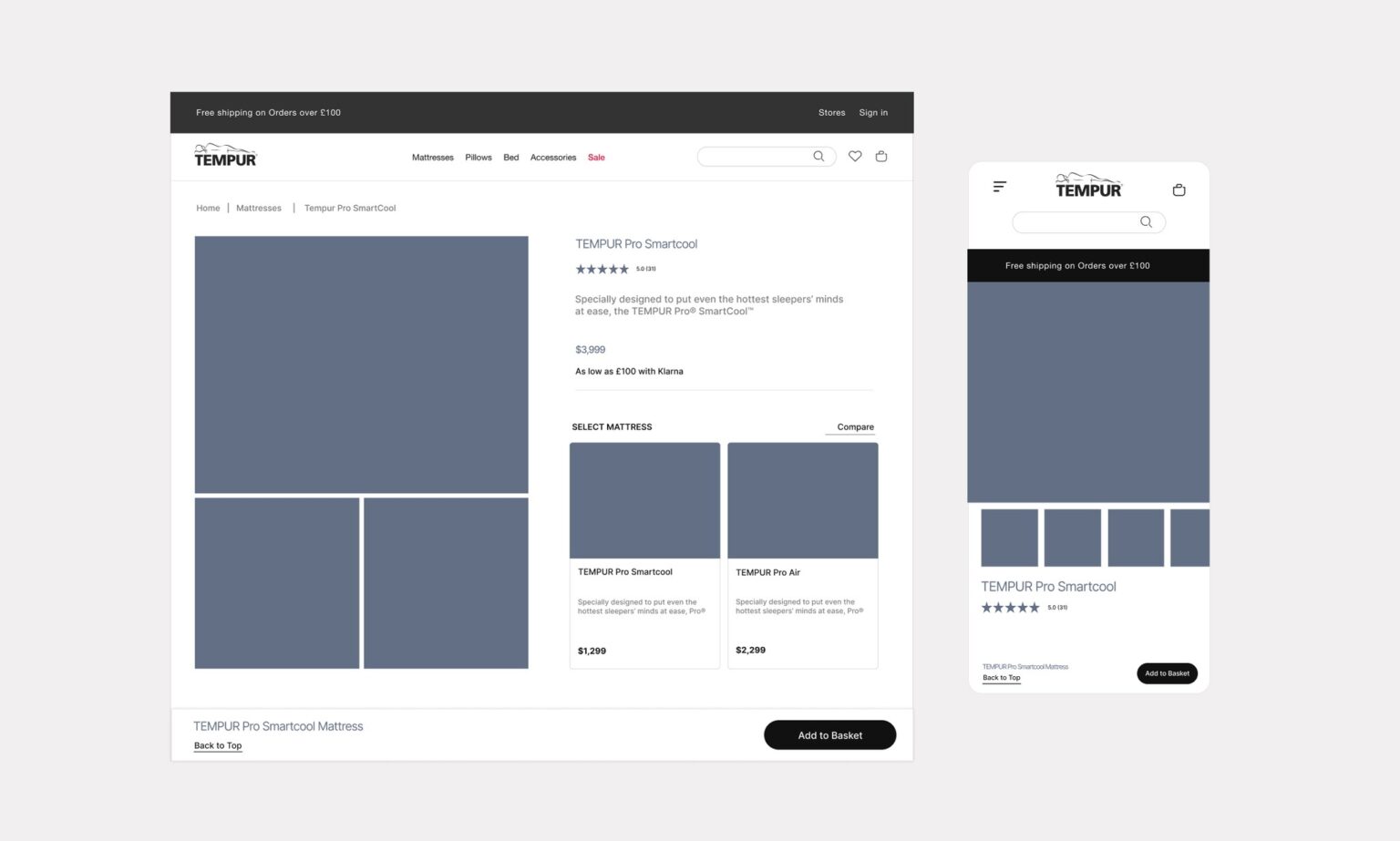
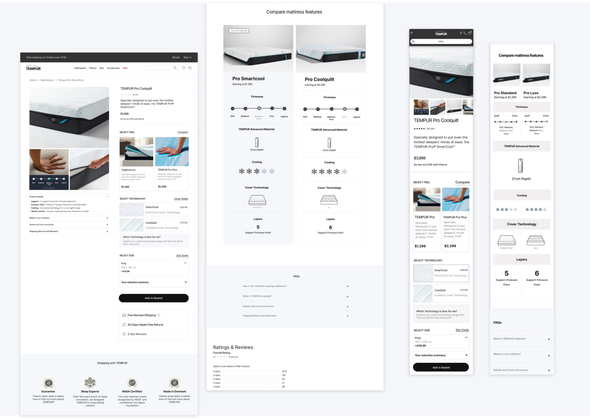
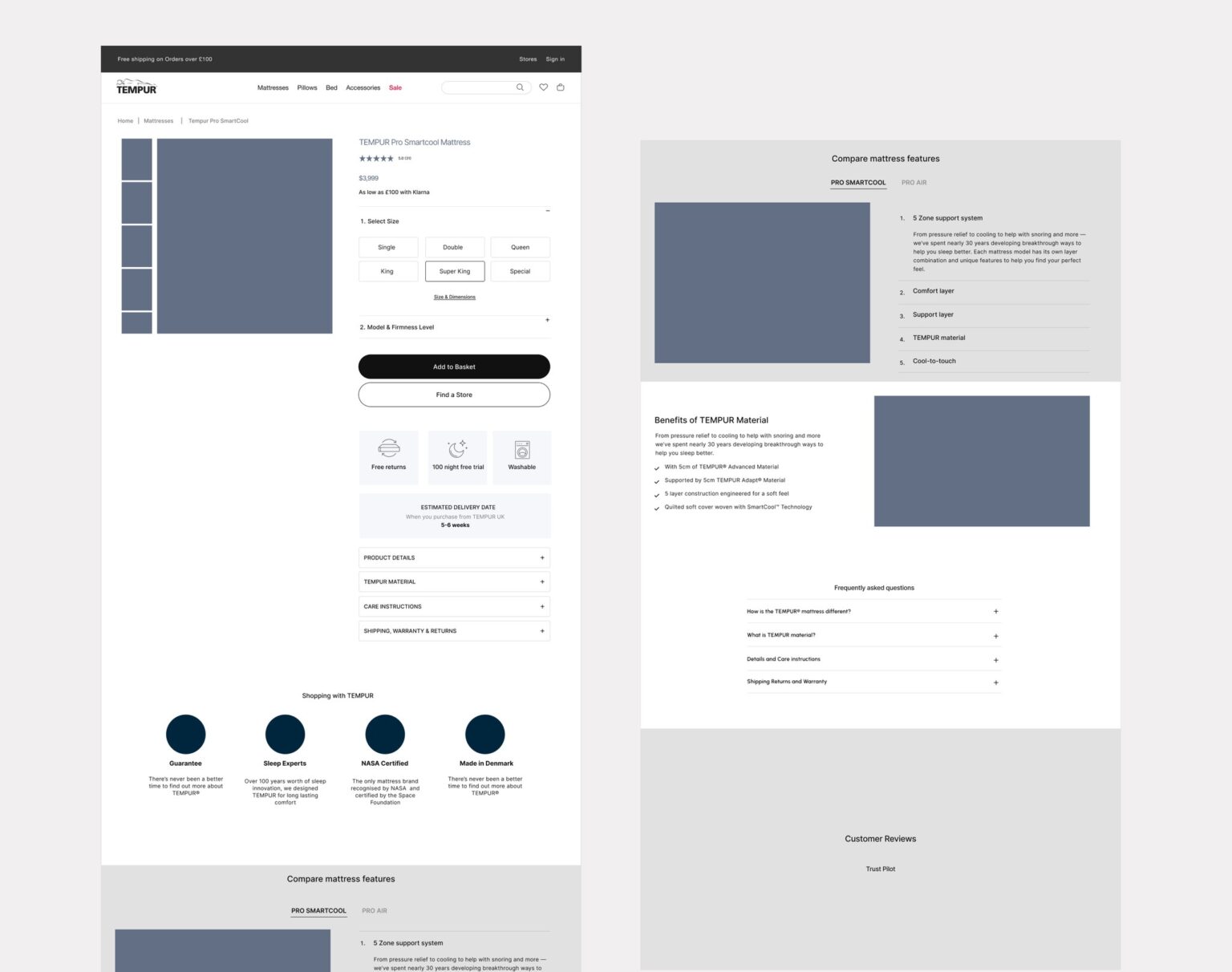
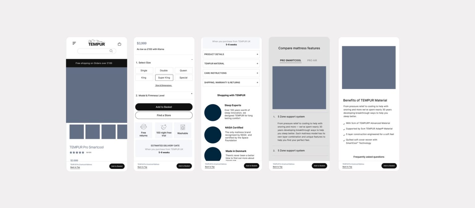
Concept 1
Concept 1
A simplified layout with benefit-led content and a clear step up story
Hypothesis #2
By swapping the order of the buy box steps, users will better understand the dynamic pricing of their selections
Hypothesis #1
By reducing redundant content, users will be able to compare more details within the buy box, reducing scroll.
Hypothesis #3
By adding new features such as sticky ATC, estimate delivery date, and more, this PDP will align with industry standards
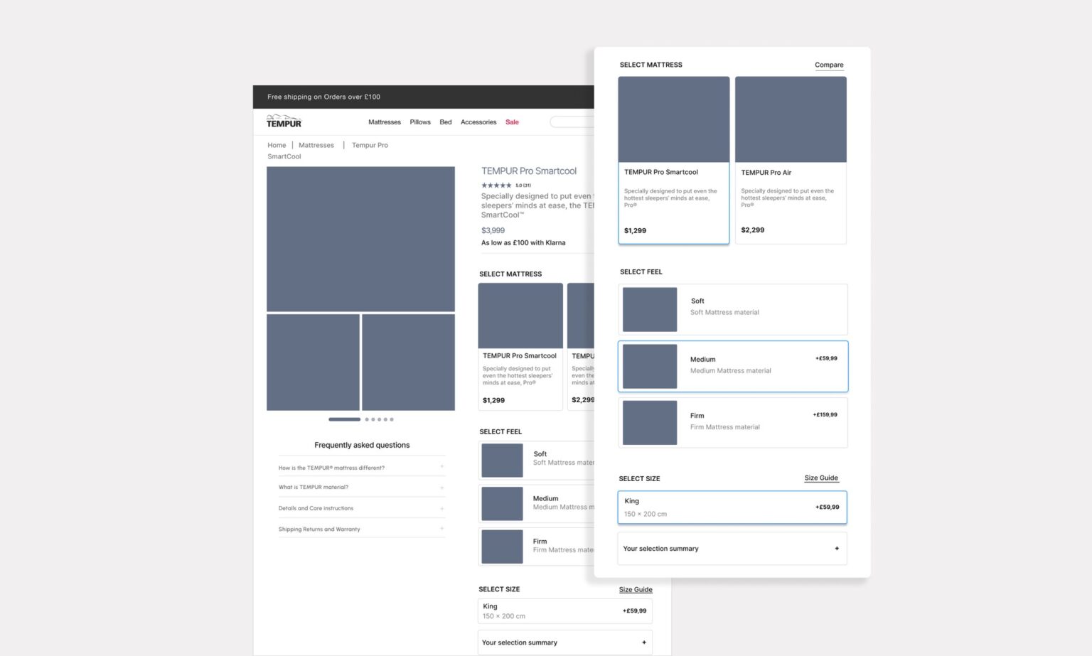
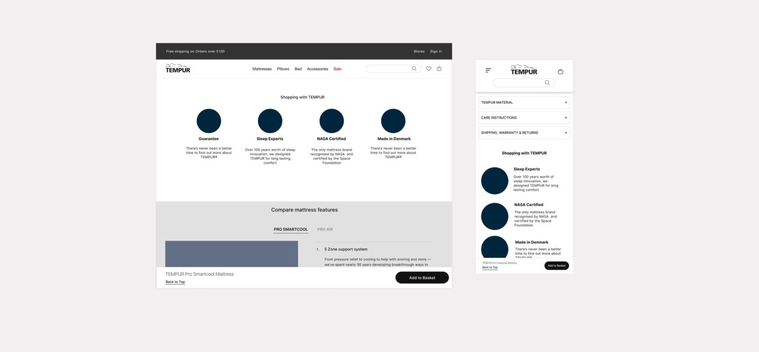
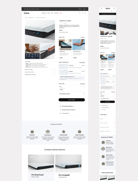
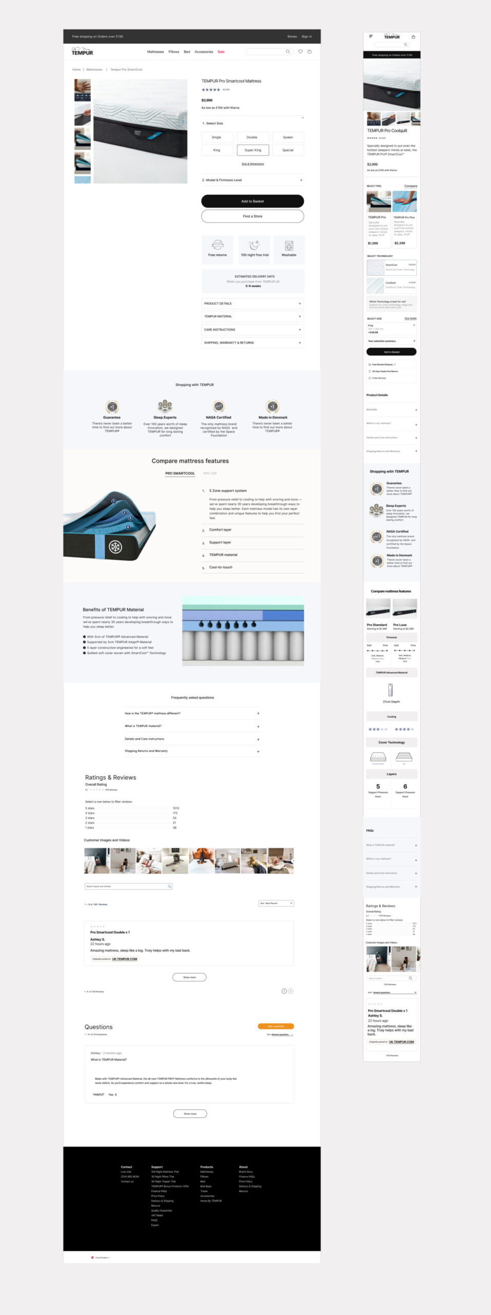
Hierarchy & content
A refreshed page with user priority in mind — comparing high-level info in the buy box with in-depth details below the fold + reduced modules
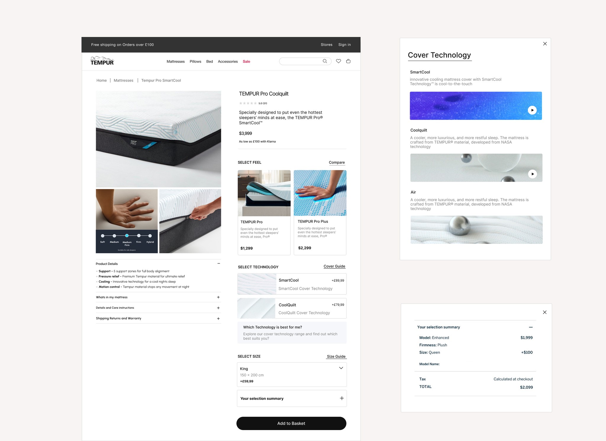
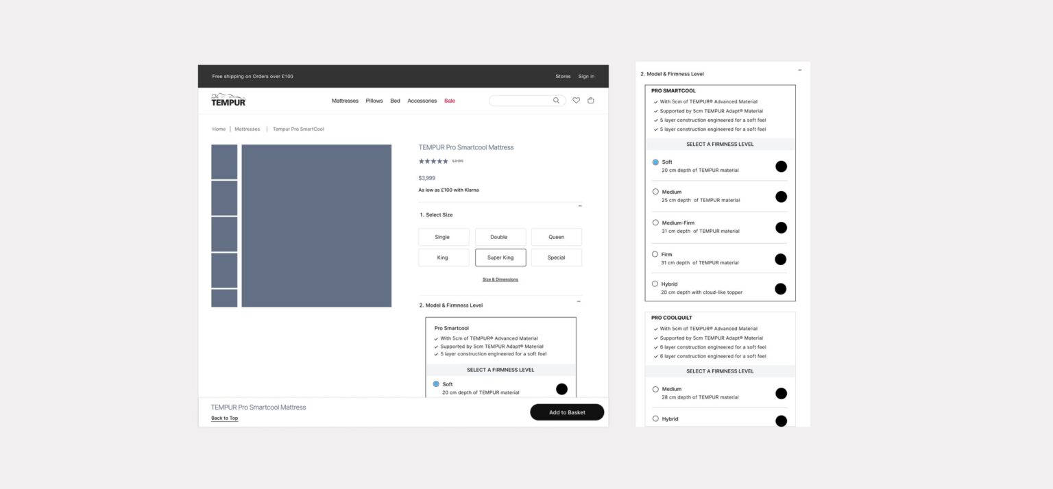
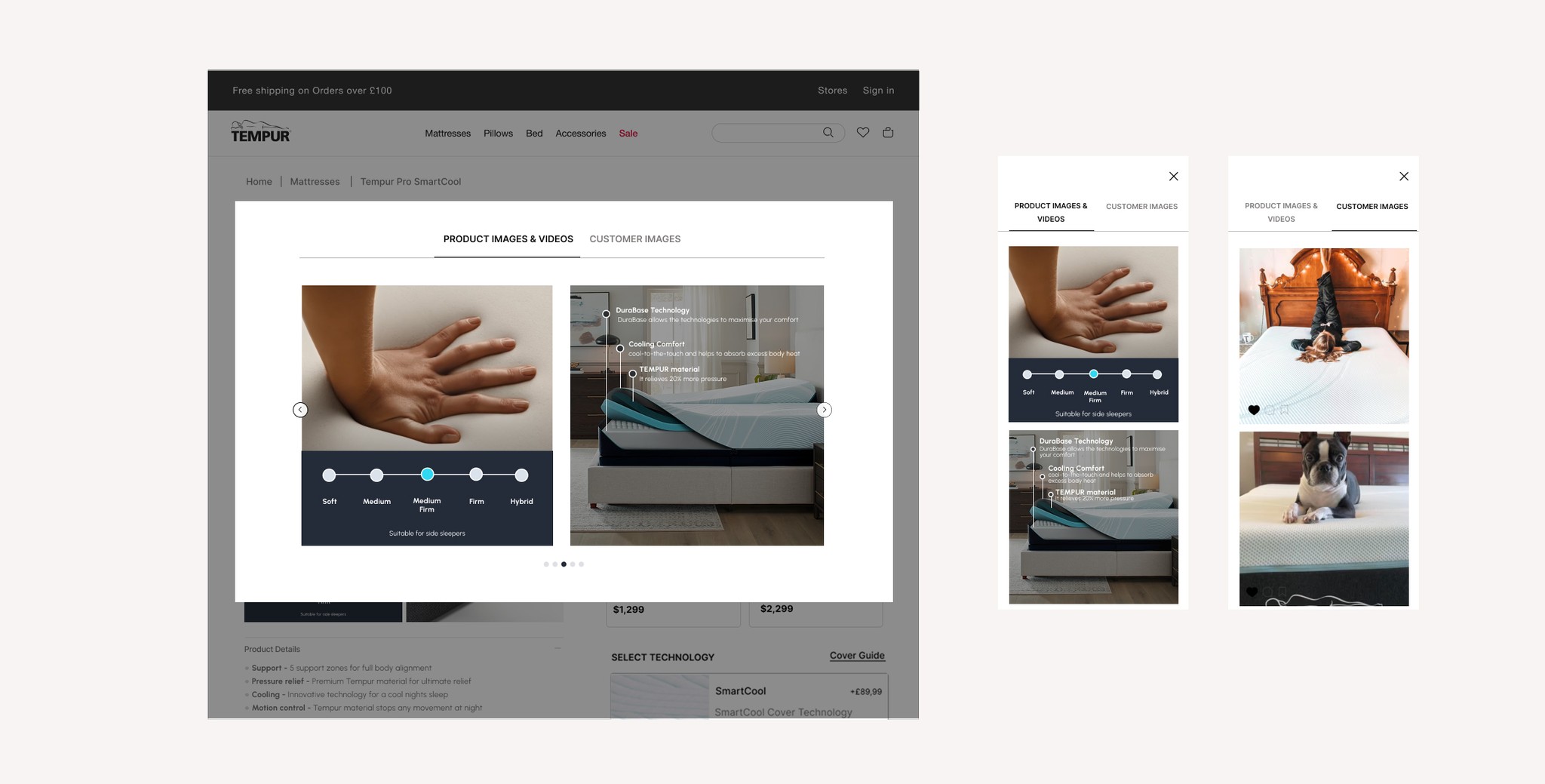
Visual upgrades & a new variant structure within the buy box
By adding supporting images to variants, users are able to quickly compare options, plus, new variant layout allows users to only see what’s available per model. A new order summary brings clarity and transparency to pricing.
Sticky functionality and anchor links
Exploring Solutions
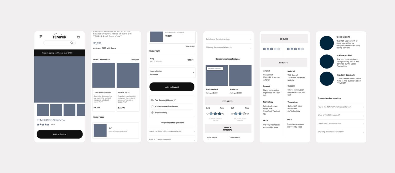
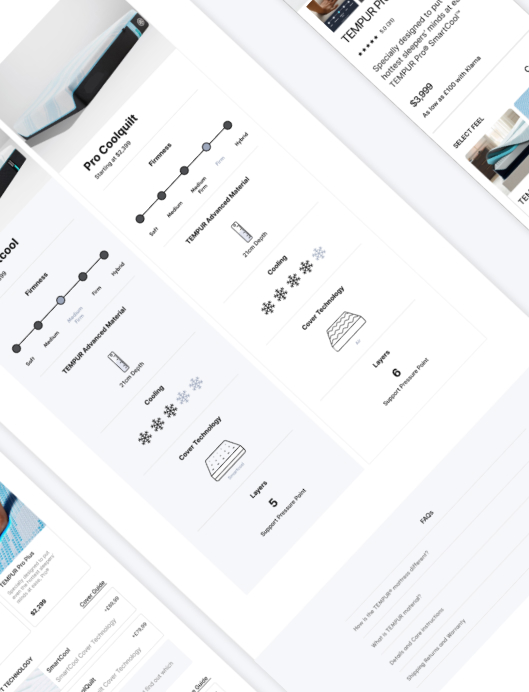
Concept 2
Concept 1
A simplified layout with benefit-led content and a clear step up story
Hypothesis #2
Showing less on land within the buy box will create less visual overwhelm.
Hypothesis #1
By nesting firmness levels within the mattress model, users will easily understand available options
Hypothesis #3
Adding an interactive mattress module will align with competitors and be more engaging than a compare chart
Hierarchy & content
A visually minimal buy box on default, leveraging accordions with a new interactive mattress cut out module in place of concept 1’s compare table
Visual upgrades & a new variant structure within the buy box
In this concept, a high-level bulleted list of benefits per model gives allows users to fully compare without leaving the buy box
Sticky functionality and anchor links
Responsive websites, web apps and corporate designs that form the foundation of ambitious digital strategies.