TEMPUR – AUDIT
Site Redesign & Global Rollout Salesforce CMS Build
Why might TEMPUR’s add to cart rate be high, yet purchase rates low?
Timeline
- Mar 2021–May 2022
Tools Used
- Sketch
- Figma
- InVision
- Salesforce
- Jira
- Asana
Tools Used
- Lead UX & UI
- Project Lead
- Marketing Communications
Collaborators
- Brand Director
- Frontend Engineers
- Backend Engineers
The Problem
Tempur.com’s add to cart rates were high, yet purchase rates low due to the lack of e-com best practices & limited site functionality, including:
- Low consideration of the full customer journey
- Broken mobile experience
- Inability to compare products
- Spec & feature heavy, hard to understand content
- Inconsistent brand identity without a UI or CMS library
- ADA compliancy violations
The Solution
By finding opportunities to educate new mattress buyers on the differences between a large spec-heavy product assortment, the site became easier for users to digest and compare. Through customer support and site value propositions, users gained buyer confidence to complete their purchase.
New Site Features:
Improved information architecture
Optimized product variants & meta-fields
Product compare CLP & PDP functionality
Reduced friction within ATC/checkout flow
Post-purchase support pathways
ADA compliant UI & brand consistent CMS
Post-Launch Results
Following the initial launch, our team continued to iterate on the site—refining designs, incorporating user feedback, and rolling out deferred features. We also extended the new design system across Weber’s global market websites, significantly accelerating development timelines and reinforcing visual and UX consistency worldwide.
In the first 90 days post-launch, the redesigned site delivered measurable improvements:
Discovery Phase
Areas of opportunity
Our goal was to fully understand problem areas to drive new solutions through the following methodologies:
- Stakeholder interviews
- Google Analytic metrics, in collaboration with our analytics team
- User research of the old weber.com
- Heuristic analysis via Nielsen Norman Group & Baymard Institute best practices
- Competitive analysis
Tempur.com Heuristic Analysis
Post-Launch Results
Feedback
Within the old Tempur.com, users reacted poorly to the site aesthetic, stating that it felt “old” and lacked personality.
Recommendations
Align with strong ecommerce brands — Vibrant • Feature-focused • Tech-forward • imagery • Storytelling
Navigation
Feedback
TEMPUR’s nav made browsing complex for visitors, as it failed to find the right balance between primary & secondary actions and buried content on mobile.
Recommendations
Casper’s clean, fixed navigation is not only ADA compliant but has clear visual hierarchy to primary actions + easy to access search.
Homepage
Feedback
In user testing, several users commented that the hero was too large with unpleasing marketing-heavy content.In user testing, several users commented that the hero was too large with unpleasing marketing-heavy content.
Recommendations
Purple Mattress heroes feature a single primary offering and are designed to be short, providing a visual cue that more content is available below.
Feedback
As a new site, many users did not realize mattress variations were shoppable due to the lack of category features.
Recommendations
Sleep Number gives clear visual representation of top-level categories directly below the hero.
Other Areas of Homepage Opportunity
- Add Personalization
An opportunity for returning users to see fresh content based on items they have previously viewed.
- Add a Product Finder Quiz
- Create Experiential Branding
Product Detail Pages
Feedback
In user testing, either users couldn’t find the info they needed at all, or they had trouble sorting through from a visual perspective.
Recommendations
For spec-heavy products, Dyson leverages a variety of visualizations that allow users to quickly scan.
Discovery Phase
CMS design & UI library
Hierarchy & consistency solved through a new design system with a flexible, reusable set of stylized interface elements.
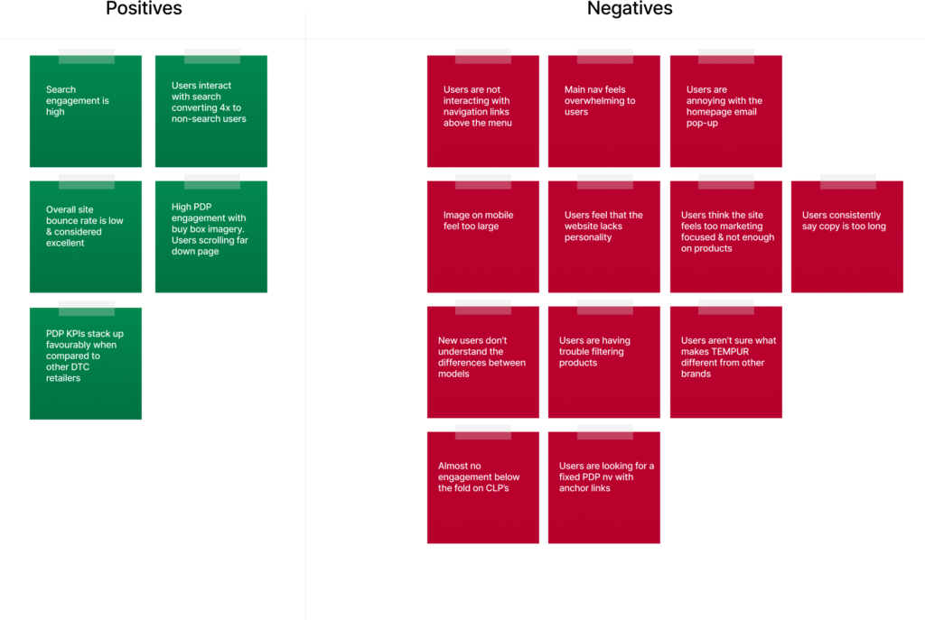
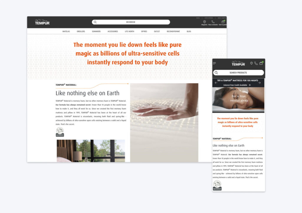
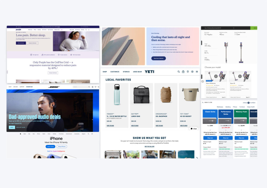
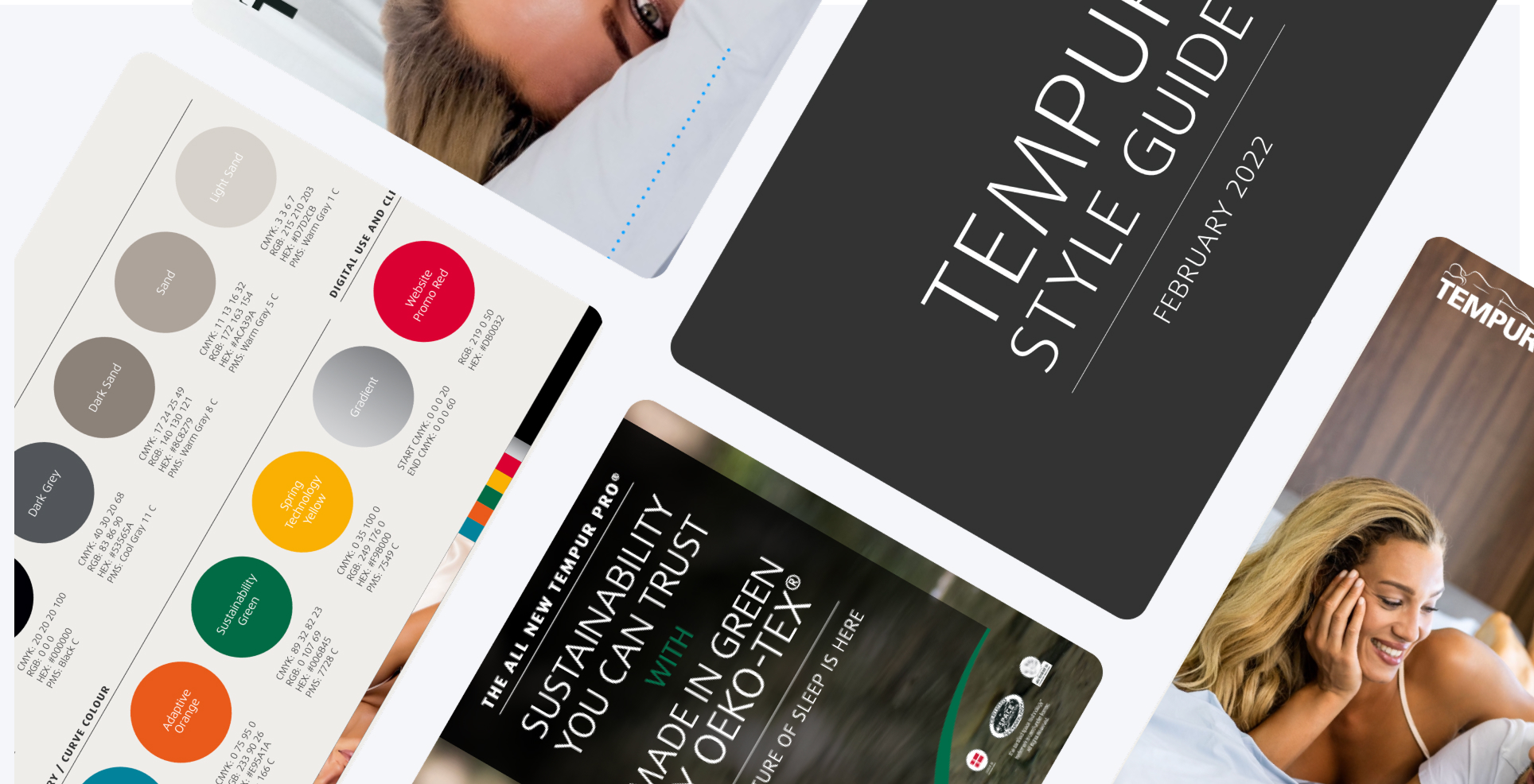
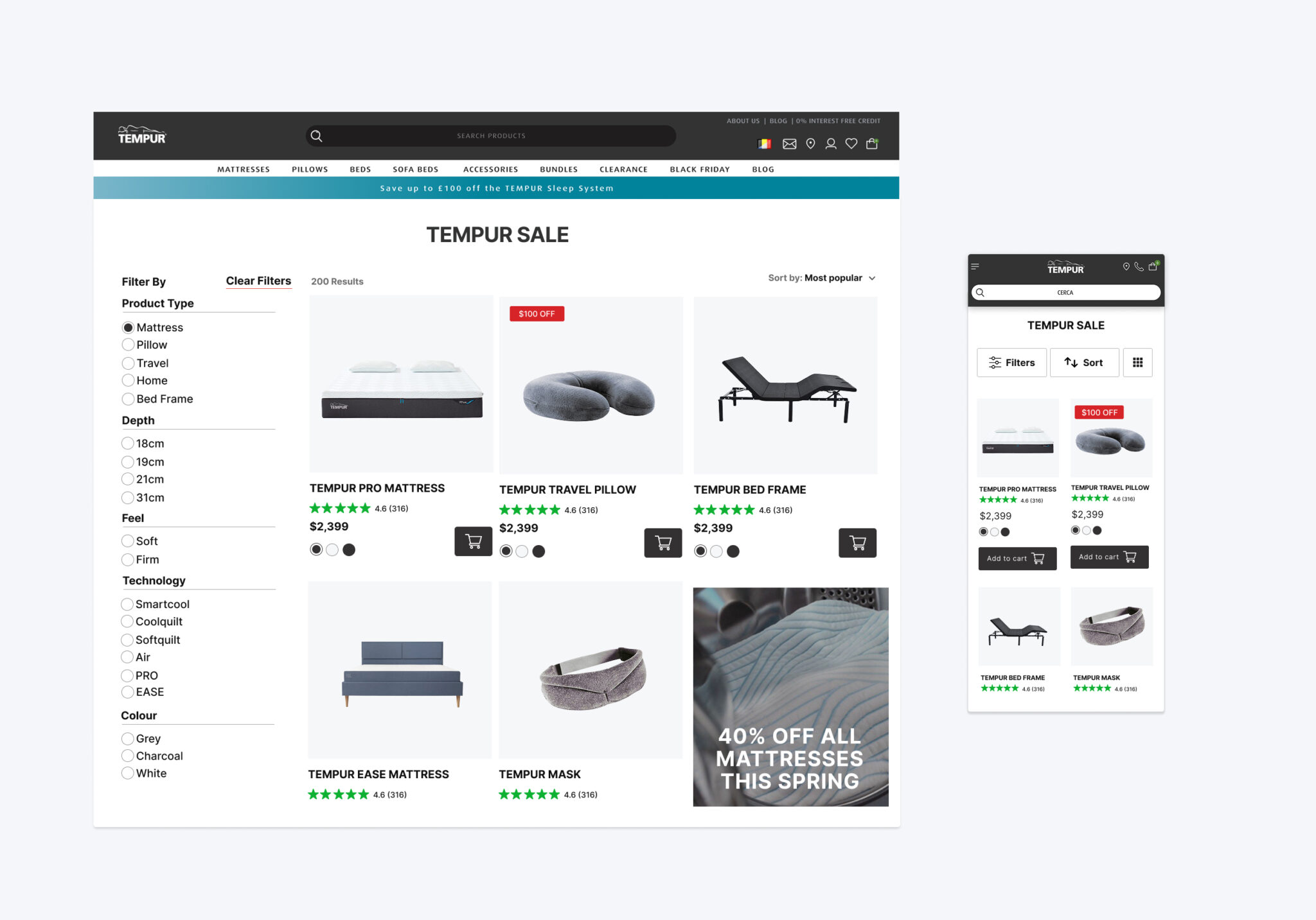
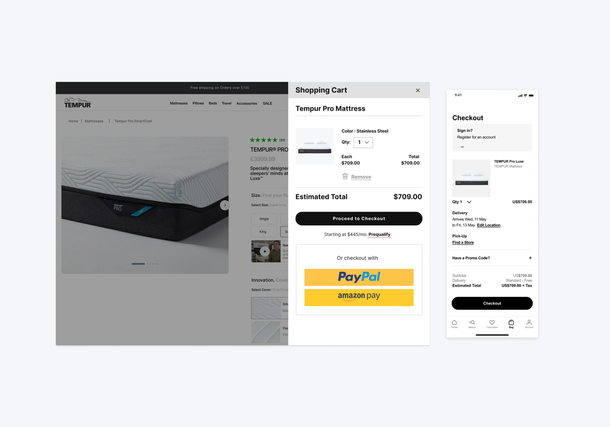
On the previous Tempur.com site, there was no unified UI library across global markets, leading to inconsistent typography, colors, and visual hierarchy. This made it difficult for users to quickly identify important content and created a fragmented experience. Although TEMPUR had an asset library, it was outdated, disorganized, and not aligned with modern design systems. Without a defined grid system or reusable components, any new page required custom development, slowing down delivery and creating inefficiencies.
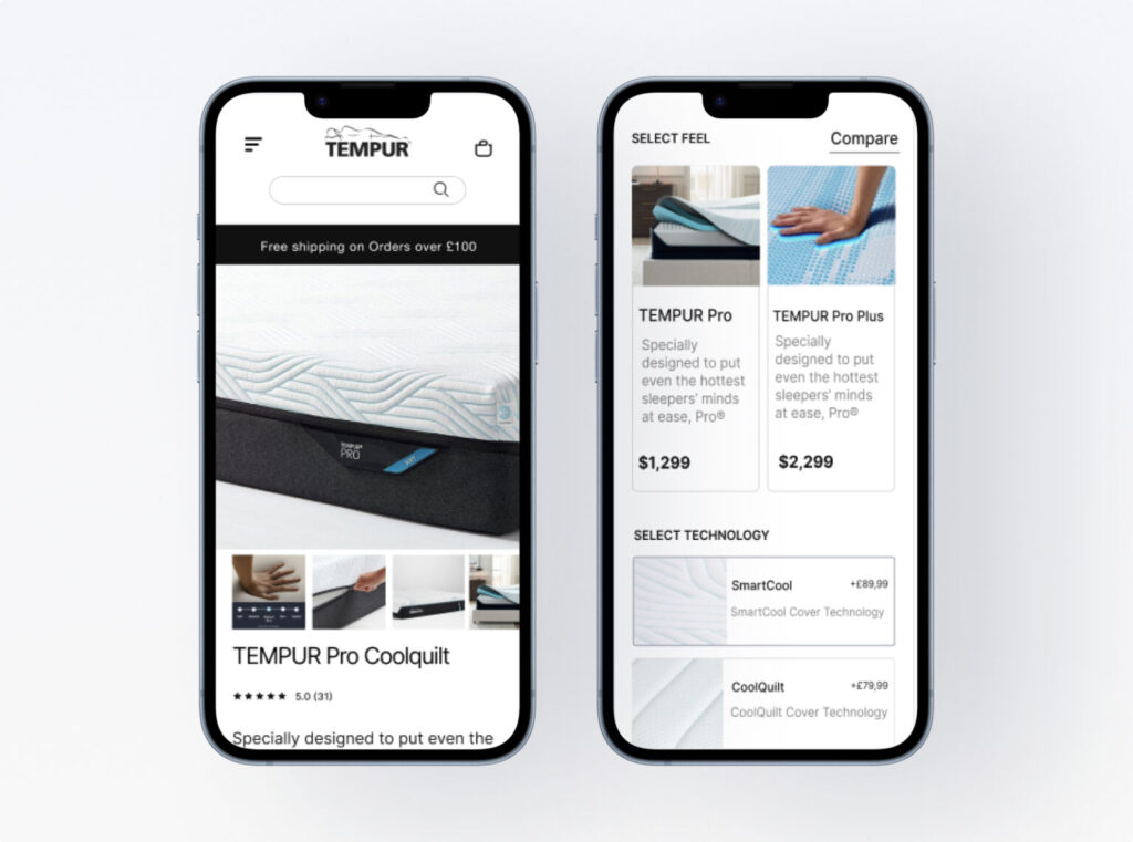
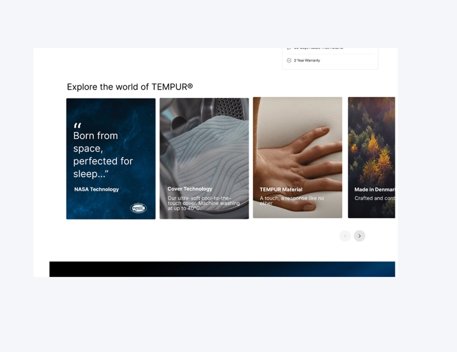
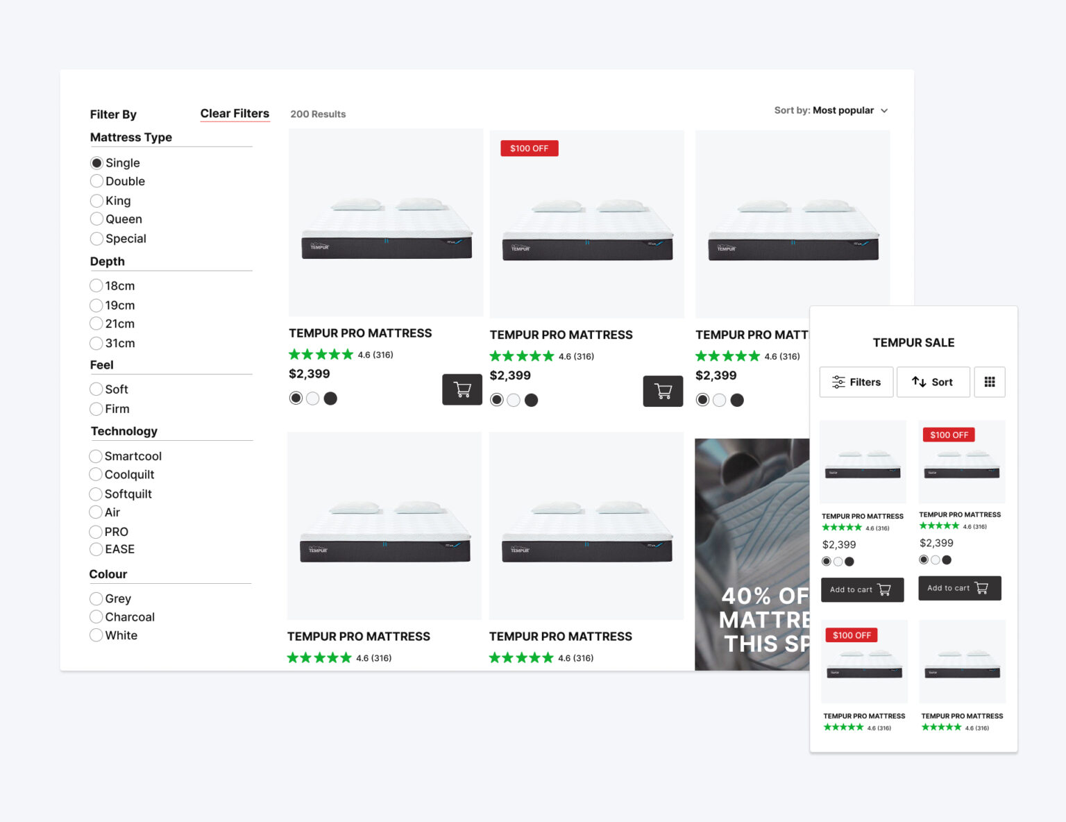
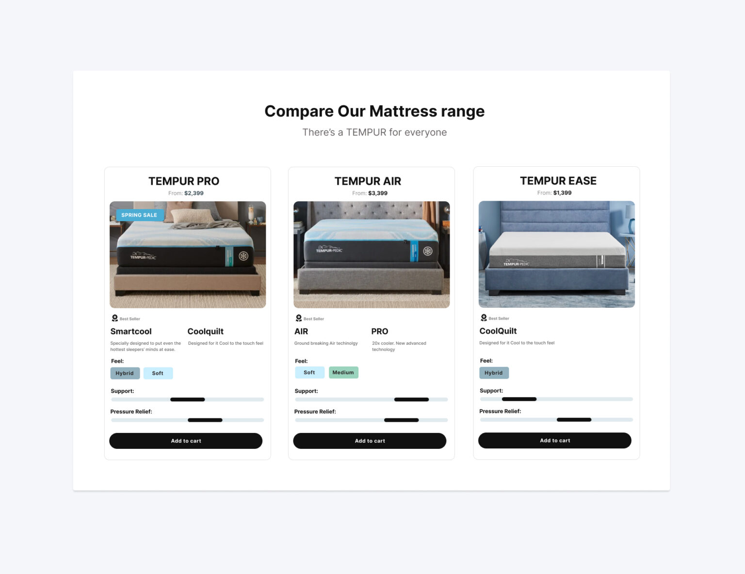
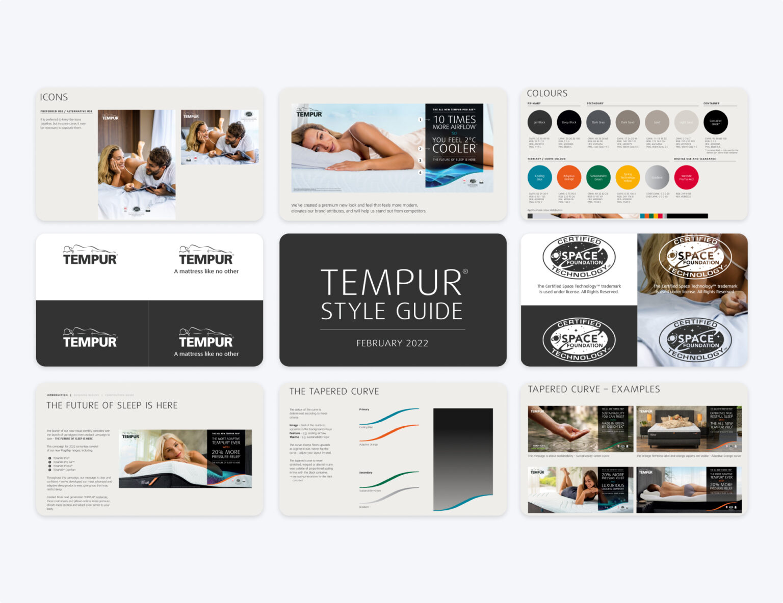
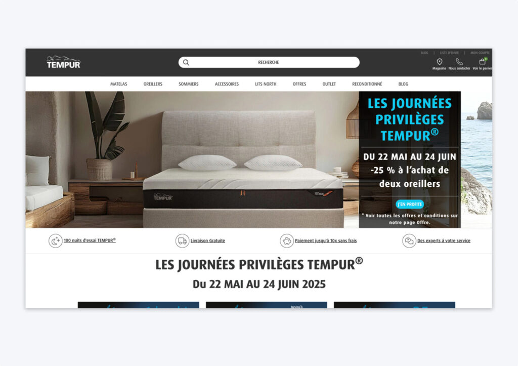
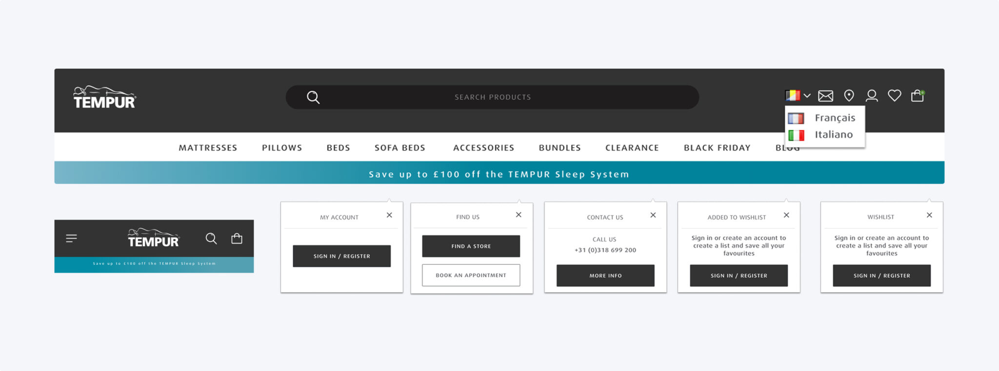
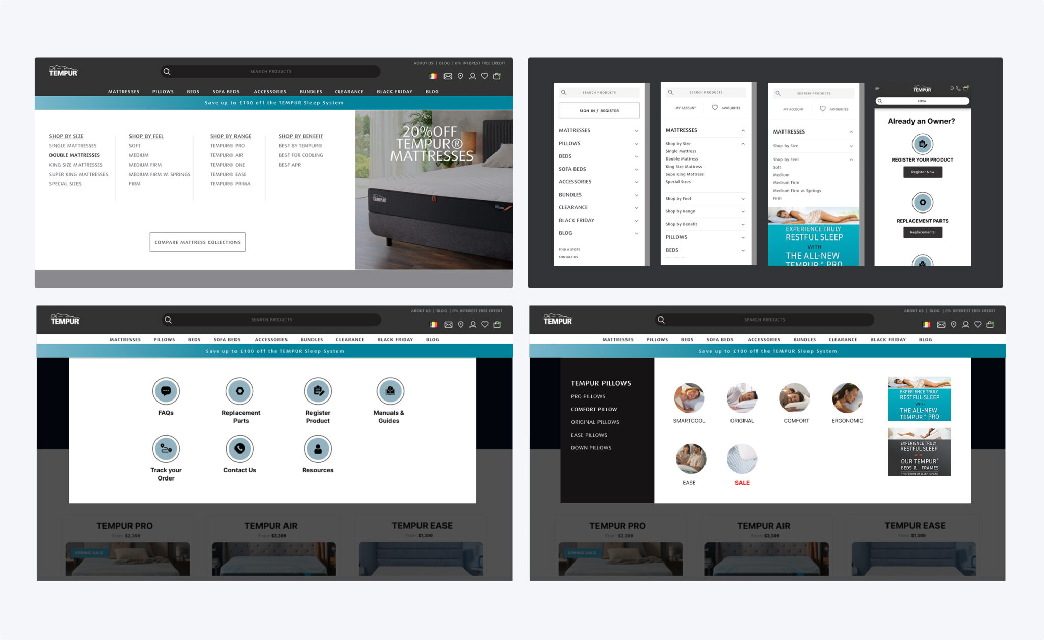
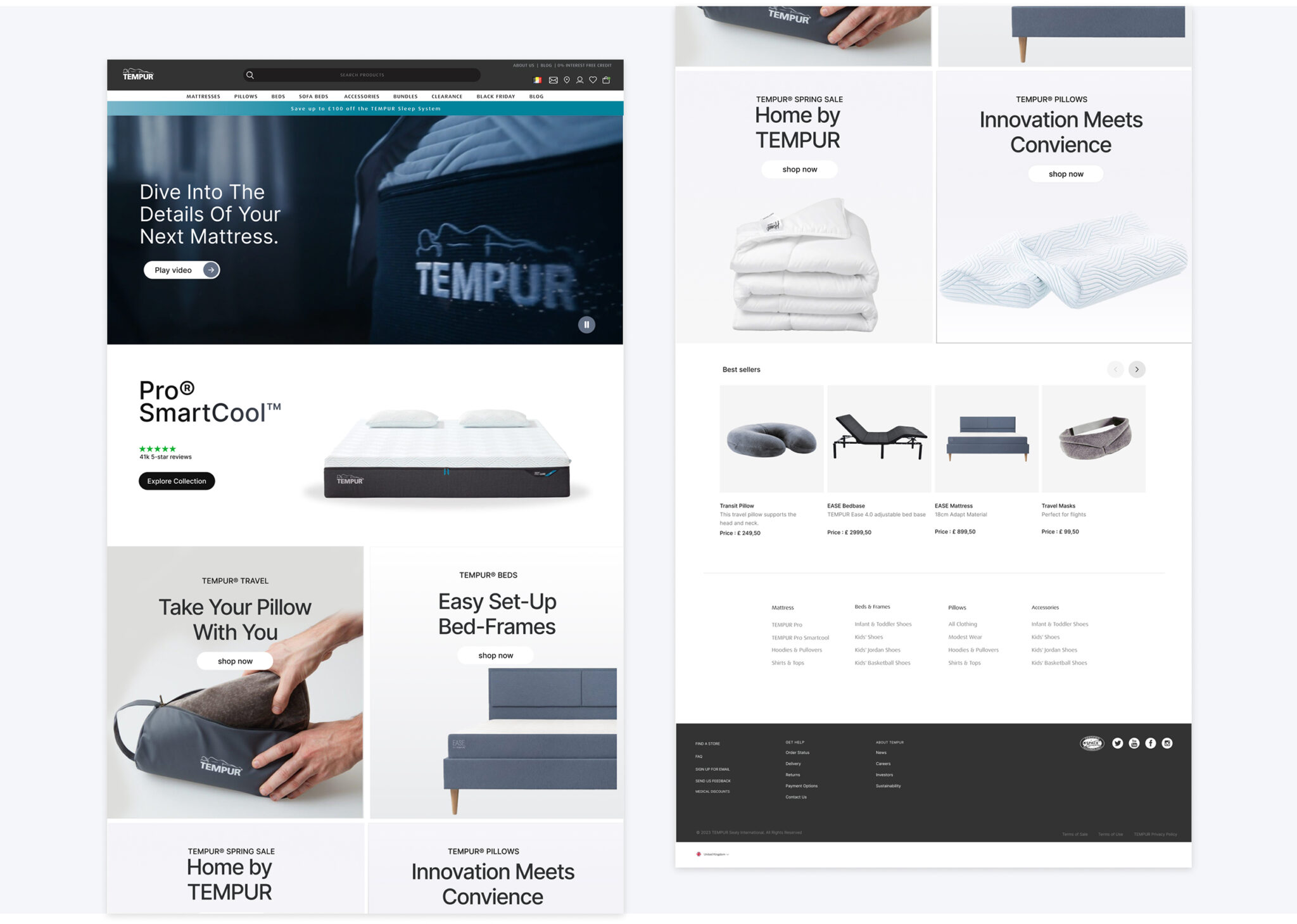
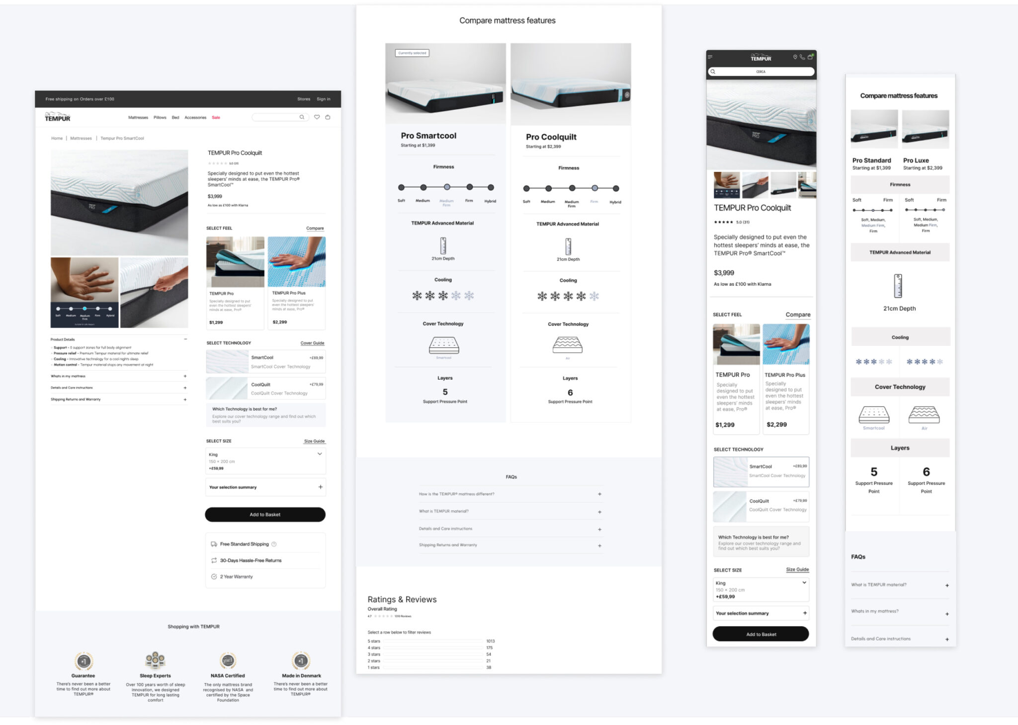
To solve this, we built a comprehensive UI library with standardized typography, color palettes, and button styles—all governed by design rules and directly integrated into the CMS. This allowed for visual consistency across pages and markets, while also streamlining the design-to-development process. The new CMS library, built for Salesforce, empowered non-designers on the TEMPUR team to create and update pages easily using modular components—shifting focus from layout challenges to content strategy.
Main Navigation
New and renamed main navigation links created a quick scan of Tempur products and access to blog, SALE and Brand.
Smaller, less important actions were moved into a secondary courtesy navigation and allowed for more focus on search, account and cart in the primary nav—all key drivers of conversion. A new mega menu approach allows users to browse Tempur products, categories and see pictures of each product type, ultimately allowing users to compare products. With a new right-hand rail, the Tempur has a placehold slot for promotions & featured content to keep the nav dynamic.
Homepage
Homepage A personalized shopping experience for all audiences
In this restructure, users now see the broad range of the products that the site offers, followed by a curated selection of CMS blocks, such as a mattress quiz, seasonal SALES, best sellers and support links for current Tempur owners. My recommendation to the was to keep the homepage short and allow for pathway modules in which users can click into and learn more if interested.
Product Detail Page
Impactful existing content revamped into a visually digestible experience
The new PDP is packed full of new features: A sticky add to cart + anchor jump link combo bar, “What’s In the Box” module, interactive mattresses comparison chart and dynamic add-on products. The most impactful change lives within the buy box. The new layout ensures that users have all key product details readily available on land and leaves content-heavy, detailed information below the fold in the features & specification section. With free shipping and return messaging, buyer confidence was increased.
From the previous site, we took buried text-based information and brought them to life through high-end, close up imagery and iconography.
Category + Product Listing Page Template
Find your perfect mattress with features you didn’t no you needed
Cart & Checkout
Introducing a mini cart was crucial to adding convenience to the user’s shopping experience, as it allowed them to quickly access checkout and gain awareness to the key Tempur value props of free shipping & returns. Through Salesforce, the full cart & checkout flow was optimized to include: An enclosed checkout experience, product upsells and 3rd party payment and financing options.
Brands I've worked with